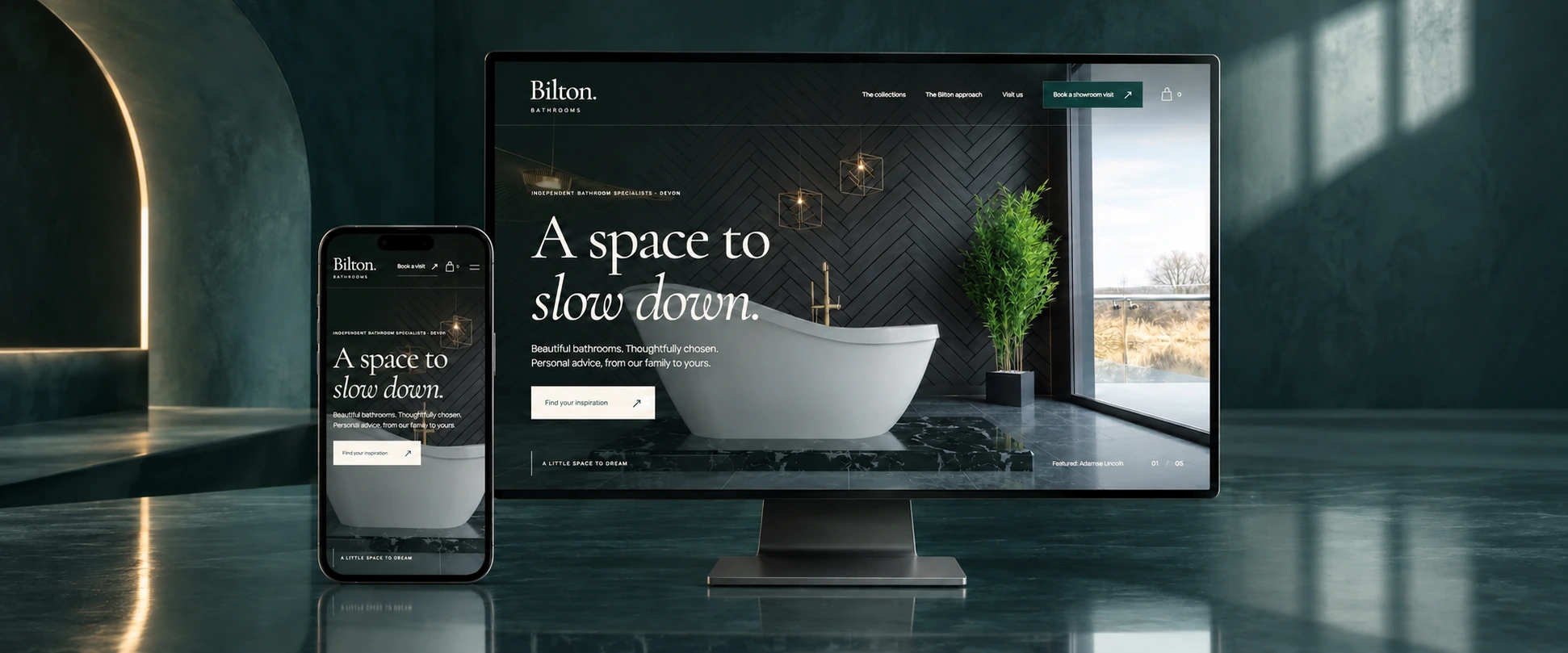
An independent homepage redesign concept for a bathroom showroom, bringing product inspiration, useful details and a showroom conversation into one considered experience.
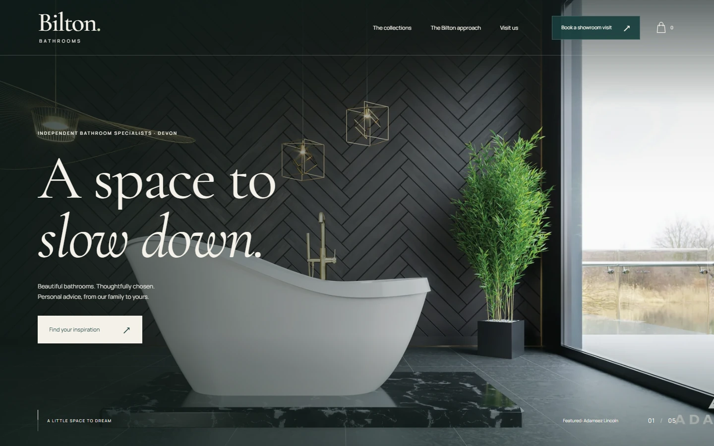
The existing website brings together a broad bathroom catalogue, manufacturer information and showroom updates. The concept explores a clearer first impression: lead with the products, introduce the showroom’s personal approach, and make the next step easy to find.
02
The design direction
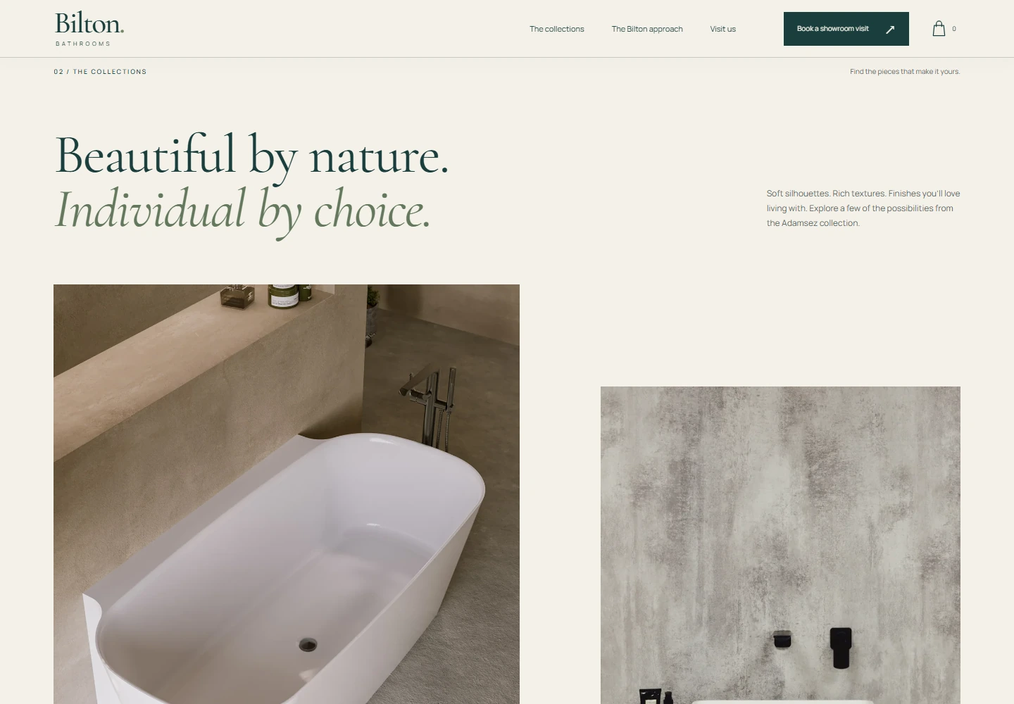
Deep teal, warm ivory and expressive serif typography give the products space. Large photography, considered spacing and gentle motion build a quieter, more cohesive browsing experience across desktop and mobile.
03
The useful detail
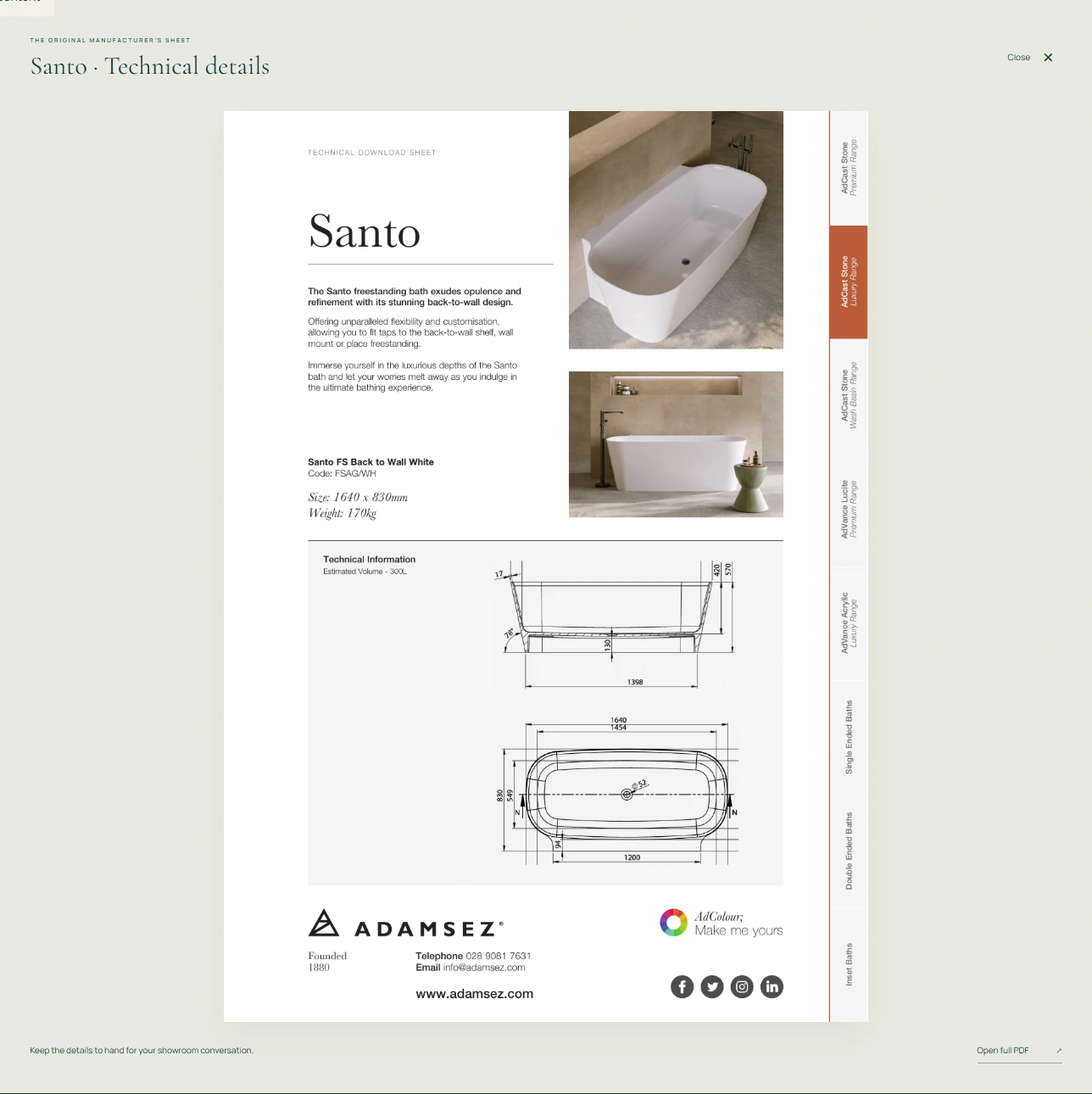
The Design Edit lets visitors switch between Lincoln, Santo and Clarendon. Each selection updates the photograph, description, dimensions, weight and estimated volume, alongside a matching technical-sheet preview and original PDF download.
04
From inspiration to a conversation
Collection navigation, a keyboard-accessible product viewer, product-specific email links and routes to the existing showroom appointment page connect browsing with useful next steps. The interface also supports reduced motion.
05
Project status & credits
This is an independent redesign proposal, not the official Bilton website or a commissioned production launch. It demonstrates the homepage and product exploration; the shopping bag is a visual placeholder, with no cart or checkout. Product photography and manufacturer sheets come from Bilton’s published collection.